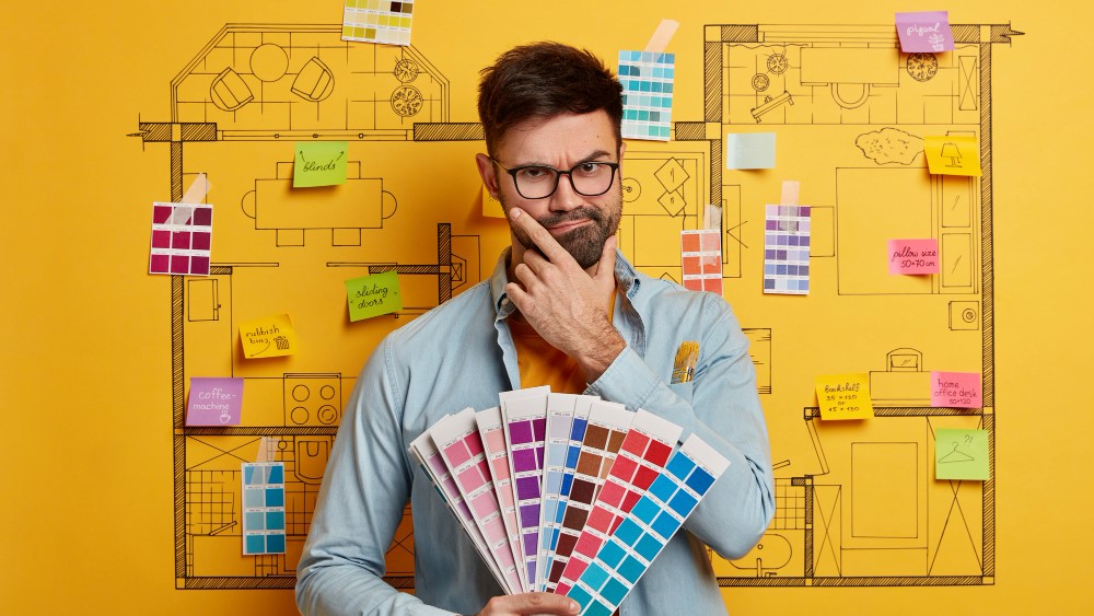
Colour has an important role in designing an interior. The most talented interior designers have an in-depth understanding of determining how the interiors of a home or a building should look depending on the expectations and needs of the inhabitant as well as what the building showcases. The colour that the interior designer affixes to a particular space have a direct effect on the mood of the space, personality, and the mindset intended to come out of it. Picking the right colour is indeed a key element of interior design. A skilled interior designer understands colour psychology and how to check all the right boxes. Here in this article, we are talking about what colour psychology is and how it impacts the delicateness of the interior space. So, before applying colour psychology in interior design, learn about colour psychology and its importance in interior design.
What is Colour Psychology?
Colours are the major determinants of the ambience and mood created by a certain space. It is necessary to choose the colours wisely so that the intended purpose of the space is conveyed properly and, if it is an official space, to the employees or visitors. Each colour conveys a different set of emotions and tones to the expanse. For example, if we pick blue, it is certain that blue relates to bringing up a sense of serenity and peaceful notions and is an ideal colour for a space that is detrimental to bringing in a sense of rest or tranquillity. The scientific knowledge behind colour psychology is that each colour possesses a different wavelength, which is exactly the same when it is connected to the emotions of humans. Hence, each colour can contribute to our spirits and can give an optimistic influence on human emotions. The wavelength and frequency of colours form the basis of colour psychology.
Impact of Colour Psychology in Interior Design
Colour schemes play an important role in interior design. Like the people who live with us, the colour of the walls, furniture, decorative pieces, and lights, also play an important role in the psyche of the inhabitant. Hence it is always good to choose colours that can have a positive impact on our personality and mood. According to the colour psychology in interior design, choosing the most suitable colour can make us feel comfortable and relaxed in our home and increases productivity at the workplace. Based on the findings of numerous studies on colour psychology in interior design, each individual reacts differently to each colour.
For example, dark colours, especially black may be depressing, unlucky, and demotivating for some people. On the other hand, some people favour black to represent functionality and structure. Likewise, some people perceive red colour as a symbol of confidence, inspiration, and vigour, while others find it frightening.
What is a Colour Wheel?
A colour wheel is an auxiliary tool that helps with the layout of colour psychology. The colour wheel helps an interior designer decide which colours will complement each other and which will not be a good fit and have the chance of creating negative contradictions. A colour wheel consists of 3 primary, 3 secondary, and 6 tertiary colours, and there may be certain other colours as well which are an extension of the tertiary set of colours. When interior designer sits down to choose colours, they go for:
- Complementary colours: These colours are the ones that fit well together in a contrast feature.
- Monochrome colours: Monochrome colours are basically colours that are from the same colour family and differences come up with their intensity.
- Analogous colours: Analogous colours are those which are seen adjacent to each other on a colour wheel.
The interior designer is also free to experiment with colours, as long as the end result gives the space the exact sense of conveyance that was intended from the start. Whether you’re looking to decorate your room or other interior space with some colour pop, discover the impact of colour psychology in interior design.
Here are some colours that can help you understand how the entire process of imbibing colour psychology into interior design works:
Blue
Blue and its different shades are one of the strongest hues in the spectrum of colours. It is found at the far end of the spectrum and is known to bring in cool elements, even in the literal meaning of temperature. Blue colour is believed to reduce blood pressure and slow down respiration and the heart rate. It has the ability to generate confidence and also easily convey the essence of loyalty, trustworthiness, and empathy.
Blue is an easy go-to colour when it comes to spaces, which provides that sense of serenity. It goes well with the decor of bedrooms and bathrooms. Blue is not only experimented with as a wall colour but also brought into pieces of furniture, bed linen, cupboards, decorative pieces, etc. Deeper shades of blue point towards masculinity, and lighter shades bring in feminine features.
Blue-coloured rooms are the exact need of the hour when it comes to unwinding at the end of the day.
Pink
Pink has been associated with the feminine side for quite a long time. The colour is now widely used in contexts other than conveying girls’ fascination with princesses. The uniqueness of the different shades of pink is another reason for its popularity.
The lighter shades of pink, like blush and flamingo, can instantly give a feminine flair, and they also help in spontaneously lighting up the space. Deeper shades of pink, like magenta and dark pink, can convey a lot of positive and creative energy and are usually a choice taken by people who want to be loud and maximalist. Coral pink shades are even more subtle versions of the colour that can act as neutrals and as a contrast in the decor of the room, such as drapes, cushions, curtains, and so on.
Purple
Purple is an underused colour that is slowly making its way into the colour trendsetter category. It infuses a sense of creativity and sophistication into the decor. It easily gives off a vibe of opulence and class. The most seen and admired lighter shades of purple, like mauve and lavender, give a sense of luxury to the room. The colour is mostly used in areas like living rooms, receptions, and places where there is a maximum visitor presence. As it induces creativity, it is also an excellent choice in offices where they deal with creativity, and it also helps create a vibrant tone in the space. Vanity spaces and bedrooms can also benefit from the darker shades of purple, as they give a sense of mystery and sensuality. As said earlier, it is considered a synonym for class and luxury, making it a good choice for business spaces that deal with luxury and designer products.
Green
Green is a colour that gives us an internal nudge towards nature. It is a colour that evidently represents growth, balance, and restoration. When done correctly, it is a colour that can have a very soothing effect on the psyche. Different shades of green can provide different sensations. Darker shades of green help bring in class and elegance. It will be an ideal choice to use them in home office spaces, bedrooms, etc. Multiple shades of green mixed together can easily form the colour palette of the room. You can incorporate this into adapting decorative pieces, furniture, rugs, etc. Applying the colour smartly in different parts of the room can also add depth and dimension.
Orange
Orange is a very unique colour and is not well adapted to households or office spaces. The colour has a very exciting, fun, and frolicsome effect on people. It is like a burst of colour and if not done right, it can immediately backfire and kill the entire mood. It is known to instil a sense of creativity and be an energy booster. So, using it in spaces like gyms and workout areas can help stimulate energetic workout sessions. Many people don’t appreciate too much orange colour; so you can always go for the milder versions like apricot, peach, etc. Given the creativity it substantiates, it can be a good colour for children’s playrooms and study rooms.
Red
Red is one of the most visible colours in the spectrum due to its exclusive wavelength. It ignites and throws light on love and passion. Red is an easy colour to work with in different aspects and to help connote various kinds of emotions and statements. The colour triggers energy and creativity, making it a good choice for home offices and studios. The darker shades of red make an exquisite impact, and the lighter shades can create a warm and cosy ambience. It is definitely a bad choice for bedrooms or areas where it is primarily intended for relaxation, as red is more of an energy booster than a downer. It is an excellent colour that an interior designer can experiment with.
Black
Black is a timeless colour that most people do not want to be associated with in their homes or offices. But an interior designer who is clever enough to incorporate the colour tactfully should be able to convince their client to adopt black for their interiors. Black is usually seen infused in homes and workspaces, ideally through fixtures, furniture, carpets, decorative pieces, etc. A black wall is also a daring choice that, when properly executed, will yield outstanding results.
Yellow
Last but not least, yellow is a sunny colour. It instils felicity and optimism in the home or office. Yellow is a happy colour that can rather be used in high-traffic areas than in bedrooms or other relaxed areas. It is associated with energy and is an excellent choice for interior areas such as living rooms, kitchens, and even playrooms. Too much yellow can be overwhelming, so it is expected to be used mindfully in the interior decor. Accent walls or accent furniture are some of the ways in which you can use yellow in homes and offices.
So, you might have got some idea about colour psychology in interior design. Practising colour psychology when working with interior designs and settings helps highlight the purpose of the room and also helps people behave in a certain way. Colour mixing must be a well-thought-out process; hence carry out with extreme precision. It is the best way to render a piece of work that can be both creatively potent and functional. Sometimes, if you think you are not that creative, get help from the best interior designer near you and create a vibrant mood.